What should a car wash website include? A practical checklist for owners
Wash packages and prices a driver can compare, memberships explained plainly, every location's hours and directions, and a clear way to join or get in touch, all easy to use on a phone. The rest depends on your wash.
Most people who open a car wash website want to decide something quickly: whether you are open, which wash to buy, whether a membership is worth it, and how to get there. A site that answers those questions on the first screen or two has done most of its job. This article goes through each part, explains when your wash needs it, and ends with a checklist you can work through with your own site open beside it.
Wash packages and what each one includes
List every package with the name it has on your pay station or menu board, its price, and what it adds over the one below it. A short list of what each wash adds is easier to compare than a paragraph about shine and protection. Keep the names identical everywhere: if a customer sees one name online and another at the pay station, they have to guess whether it is the same wash.
Leaves them guessing
“Our premium wash gives your car the shine it deserves, starting at a great price!”
Answers the question
“Best: [price] a wash. Everything in Better, plus [extra service].”
The clear version names the wash as the pay station does, gives the price and says what it adds.
Single washes and memberships, kept apart
If you sell memberships, show the single-wash price and the monthly membership price as two different things, each labelled. A membership price should say that it is charged every month until the member cancels, so nobody reads it as a one-time price. Say whether a membership covers one vehicle, and which locations it works at if you have more than one.
Leaves them guessing
“Unlimited washes [price]!”
Answers the question
“Unlimited Best: [price] a month for one vehicle. Renews monthly until you cancel. Good at every location.”
If you do not sell memberships, skip this part. A single-location wash with a simple menu needs fewer pages, not more.
Location, hours, directions and contact
Each location needs its street address, its opening hours, a directions link that opens the phone's map app, and a phone number that can be tapped to call. Put holiday hours and weather closures on the site on the day they apply, where people look for hours, and take them down afterwards.
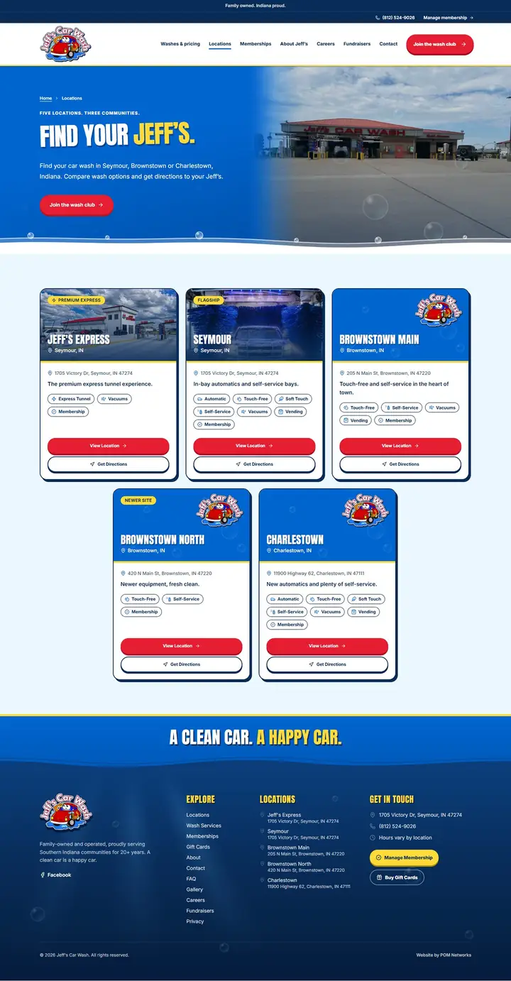
With more than one location, one page that lists every location is easier for customers to scan and easier for you to keep current than addresses scattered across pages. Jeff's Car Wash lists every location on a single Locations page. Note anything that differs between locations: hours, packages, membership plans and amenities.
Easy to use on a phone
A driver checking your hours from a parking lot is using a phone, and so is the search engine: Google says it uses the mobile version of a site's content for indexing and ranking. Design for the phone first, and keep the same content on the phone as on a computer.
- A menu that opens with one tap and lists the few things people come for: washes, memberships, locations, contact.
- Text that reads without zooming, in short lines.
- Buttons and links large enough to tap. The accessibility guidelines set a minimum target of 24 by 24 CSS pixels; bigger is easier with a thumb.
- Nothing that covers the first screen before the visitor has seen it, such as a pop-up offer.
A clear way to join
Give each membership plan its own button, labelled with the plan (“Join Unlimited Best”, not “Learn more”), that lands on the signup page for that plan. How to make membership signup easier goes through the whole path.
Checkout links, embedded checkout and deeper integrations
There are three common ways a website can hand a customer to your membership provider. Which ones are open to you depends on your provider, not on your website designer, so ask the provider what it supports before you plan the site.
| Approach | What it means | Fits when | Tradeoff |
|---|---|---|---|
| Checkout link | The join button opens your provider's own signup page. | Your provider already has an online signup page. | The customer leaves your site, and what they see next is up to the provider. |
| Embedded checkout | The provider's signup form sits inside a page of your website, in a widget the provider supplies. | Your provider offers an embeddable form and you want customers to stay on your pages. | Only possible if the provider offers it; its look and what you can measure are usually limited. |
| Deeper integration | Your website exchanges information with the provider's system, for example to show live plans or member details. | You need more than a link, and the provider gives documented access for it. | More cost and testing, and it needs upkeep when either system changes. |
The car wash sites we have built use checkout links: each join button goes to the wash's own checkout or member portal. Custom integrations are possible, and we quote them separately.
Amenities, support and cancellation
List amenities such as free vacuums, mat cleaners or towels only where they are true, and say which locations have them. A customer who arrives for something your site promised and finds it missing remembers that more than the wash.
If you sell memberships, members will need to update a card, change a plan, cancel, or ask about a wash that did not go right. The site should say how to do each, or link to where your provider handles it, plus a way to reach a person. Answering it once on the website saves your staff answering it at the pay station.
Your own photos, described in text
Use photos of your own wash: the entrance, the tunnel, the vacuum area, the lot. They help a first-time customer recognise the place when they pull in, which a stock photo of someone else's wash cannot do. Give each informative photo a short text alternative that says what it shows, and give purely decorative images an empty one so screen readers skip them, as the W3C image guidance describes.
Keep prices, hours and plan details in the page text, not only inside an image or a menu-board photo. A screen reader cannot read text in a picture, and an image has to be remade every time a price changes.
Speed, and buttons that work
Large photos and videos are the usual reason a car wash site is slow on a phone. Sending desktop-sized images to a phone can use two to four times more data than needed. Size images for the screen they are shown on, compress them, and keep any video on the first screen short and light. Google's Core Web Vitals set a target for each, to be met on at least three visits in four: the main content shown within 2.5 seconds, a response to a tap within 200 milliseconds, and almost no shifting of the layout while it loads.
For reference, the Tiger Xpress Carwash site scored 94/100 and the Jeff's Car Wash site 90/100 in mobile speed tests (Nov 2026, the median of three tests of each live site).
Measure the actions that matter
Decide which visitor actions matter to your business before you look at any report: calls, taps on directions, clicks on a join button, contact form messages, job applications. Set up your analytics to record those actions, without collecting names, phone numbers or other personal details. Then you can see which pages lead to them and spot a button nobody uses.
A click on a join button tells you someone started signing up. It does not tell you they finished. The membership article explains why a click is not a sale.
When your wash needs less, or more
- One location and no membership program: packages, prices, hours, directions and contact may be all you need.
- Several locations: a page or section per location, a way to choose a location before joining when plans differ, and one place to change each location's hours.
- Fundraisers, fleet accounts or hiring: a page for each, so the request does not have to come through the phone.
- Seasonal events or promotions: a place for them that can be switched off on the right day.
The checklist
Packages and prices
- Every package listed, named as on the pay station
- A price for each single wash
- What each wash adds over the one below
Memberships (if you sell them)
- Monthly price, labelled as recurring
- What each plan covers: vehicles and locations
- One join button per plan, labelled with the plan
- Each button reaches that plan's signup page
- How to update a card, change a plan or cancel
Locations
- Address, hours and a tappable phone number for each
- A directions link that opens the map app
- Holiday and weather closures, on the day
- Amenities listed only where they exist
On a phone
- Menu opens with one tap
- Text readable without zooming
- Buttons easy to tap with a thumb
- Nothing covering the first screen
Content
- Photos of your own wash
- Text alternatives on informative photos
- Prices and hours in text, not only in images
- Images sized for phones
Measurement
- Calls, directions, join clicks and forms recorded
- No personal details in what is recorded
- Someone looks at it every month